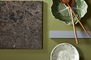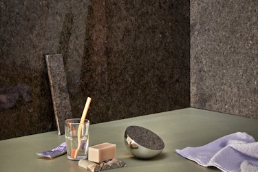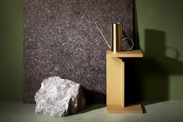
Here, Dagny and KOI Colour Studio opted to combine one shade of green, Bancha Green from Farrow & Ball, with others in the mood board, along with shades of brown and a hint of inky blue in the form of Serene Blue 5490 from Jotun. Photo: Margaret M. de Lange. Styling:Kirsten Visdal.
Photo by: KOI Fargetsduio/Foto: Margareth M. de Lange/Styling: Kirsten Visdal.
Combine warn brown tones in Lundhs Antique with Bancha Green
Bancha Green from Farrow & Ball is a fascinating, warm tone of green. It’s a little stronger than olive green, creating a room with a warm and organic feel. All shades of brown have red in them, and because green is a complementary colour to red, it brings it out nicely, giving the stone a reddish appearance. There are plenty of ways of extending a palette. Green is the most prevalent colour in nature and the one we are most used to seeing other colours set against.

Lundhs Antique in combination with green painted floor - Local Green 8546 from Jotun. Photo: Margaret M. de Lange. Styling: Kirsten Visdal
About Dagny Thurmann-Moe & KOI colour Studio
Creative Executive, Colour Designer and Consultant in urban space and architecture, Dagny is one of Norway’s most recognised colour experts. Having worked as a colour designer for over ten years, Dagny is passionate about incorporating colour into both public and private spaces and has worked as a colour consultant for a variety of prestigious projects. In 2017 Dagny published the book Farger til folket! (Colour to the People!) with Cappelen Damm, which highlights why and how colour should be used in a more considered and targeted way in architecture, interiors, public spaces, fashion and car parks.

Lundhs Antique with a painted green wall, Sap Green from Farrow Ball, and Local green from Jotun on the floor. Photo: Margaret M. de Lange. Styling: Kirsten Visdal .