Collaboration with KOI Color Studio
Recently, we have been collaborating with renowned Colour Designer and Expert Dagny Thurmann-Moe and her KOI Colour Studio to explore the versatility of Lundhs Real Stone, showcasing how the different natural stones can work in harmony with a variety of colours palettes, materials and textures. In this blog, KOI Colour Studio’s most recent moodboards demonstrate how Lundhs Blue, Lundhs Royal and Lundhs Emerald can be paired with gorgeous colours to create beautifully stylish and modern schemes.
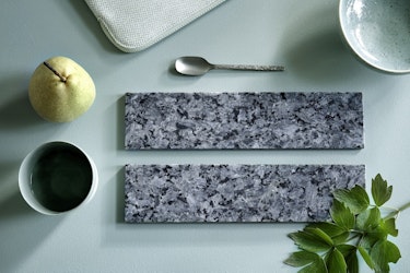
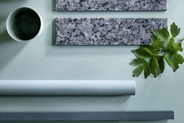
Lundhs Royal & Dusty Light Blue
The lightest in the Lundhs Real Stone collection, Ludhs Royal is a wonderfully crisp and detailed natural stone. Seen here set against Farrow & Ball’s dusty blue-green Dix Blue, the stone looks refined and elegant against the cooler colours. Clean and clear, the matte surface makes it less shimmery, creating a smooth, modern appearance.
Here, KOI Colour Studio combined the delicate blue-green shade with some pops of fresh green to complement the palette. A dusty yet refreshing overall aesthetic, this palette can be further expanded with the addition of warm woods and more shades of blue and green, as well as a wide range of metal finishes – it is a magnificently versatile palette choice, perfect for the kitchen.
“Lundhs Royal is a pale, grey, icy blue. Delicate in its nuances, in a way that makes it elegant, sophisticated, the natural stone has indefinable depth of pigmentation that makes it look like you’re looking down into something big, something endlessly deep,” says Dagny Thurmann-Moe.
Lundhs Royal in perfect combination with the dusty blue-green Dix Blue from Farrow & Ball:
Lundhs Royal combined with Farrow & Ball’s dusty blue-green Dix. Styling: Kirsten Visdal, photo: Margaret de Lange
Lundhs Emerald & Lavender
Lundhs Emerald may be the darkest stone in the Lundhs Real Stone collection but it can pair effortlessly with light, dark and even colourful schemes. A stunning natural stone, Lundhs Emerald can change from looking all black to reflecting the deep blue feldspar crystals in the Larvikite.
The perfect pairing, Pure & Original’s Mauve Love shade acts as a breathtaking contrast to the dark tones of Lundhs Emerald. Fresh and clear in its appearance, the slightly dusty lavender colour really brings out the green shades from the Lundhs Emerald matte surface.
Expand further with additional shades of purple
The palette can be expanded further with additional shades of purple as well as reddish browns, which have a close relationship with the background colour of the stone. Deep petrol colours and green shades will also create an extra contrast to the overall look, adding an extra dimension to an interior. All types of wood will work well with this palette.
The perfect pairing, Pure & Original’s Mauve Love and Lundhs Emerald:
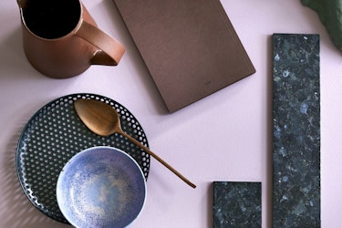
Lundhs Emerald paired with Mauve Love from Pure & Original’s. Styling: Kirsten Visdal, photo: Margaret de Lange
Lundhs Blue & Pitch Blue
Colourful and distinctive, yet beautifully refreshing, Farrow & Ball’s Pitch Blue is the ideal backdrop to the Lundhs Blue natural stone surface. Seen here in a polished finish, Lundhs Blue takes on a more dramatic role in this moodboard, with the blue shades appearing deeper, stronger and more intense.
The polished finish of the stone makes the colour appear darker in comparison to a matte finish. Combined with luxurious matte gold metallics, minimalistic accessories and a whole spectrum of complementary blue shades, this palette is the ideal way of bringing colour into the kitchen in a stylish and contemporary way.
Lundhs Blue combined with Farrow and Ball's Pitch Blue:
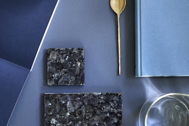
Farrow & Ball’s Pitch Blue is the ideal backdrop to the Lundhs Blue. Styling: Kirsten Visdal, photo: Margaret de Lange
Next month we will be focusing on the increasing popularity of ‘new neutrals’ within interior design and exploring how our Lundhs Real Stone collection can be paired easily with a wonderfully warm palette of creams, terracottas and stone shades.
Order your samples
If you would like some Lundhs Real Stone samples for your own moodboard at home, you can now order samples from our webshop page. If you have any questions about any of our stones, please do not hesitate to get in touch!