Photo: Margaret de Lange
How you choose to incorporate colour into your home will have a direct impact on how you feel when you are in certain rooms and as such, it’s important to use different tones and shades depending on what you use the room for and how you want to feel. The bedroom, for example, is a place where you need to feel calm and at ease and will therefore use more relaxing hues, whilst the kitchen is a vibrant and energetic space that can be filled with colours that evoke a sense of happiness and inspiration.
Exploring the latest colour trends in combination with our very own Lundhs Antique natural stone, we’ve teamed up with renowned Colour Designer and Expert Dagny Thurmann-Moe and her KOI Colour Studio, to demonstrate the versatility of Lundhs Real Stone and its ability to work with a whole host of colours, textures and materials in perfect harmony, from mustard yellows and chalky corals to olive greens and warm terracottas.
Dagny Thurmann-Moe & KOI colour Studio
Creative Executive, Colour Designer and Consultant in urban space and architecture, Dagny is one of Norway’s most recognised colour experts. Having worked as a colour designer for over ten years, Dagny is passionate about incorporating colour into both public and private spaces and has worked as a colour consultant for a variety of prestigious projects. In 2017 Dagny published the book Farger til folket! (Colour to the People!) with Cappelen Damm, which highlights why and how colour should be used in a more considered and targeted way in architecture, interiors, public spaces, fashion and car parks.
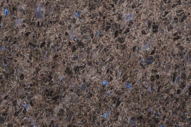
The oldest stone in our collection, the Lundhs Antique stone itself was crafted 1000 million years ago by nature on the west coast of Norway when igneous rock formed from the cooling of magma. Speaking of Lundhs Antique, Dagny states: “Lundhs Antique is something special. Even the moon consists partially of anorthosite! The brown tones combined with the embedded crystals to give a blueish reflection in places and add a warm glow to the surface. We are at an significant turning point when it comes to colour use in the home, and the colour of Lundhs Antique has the ability to change to reflect your choice with ease.”
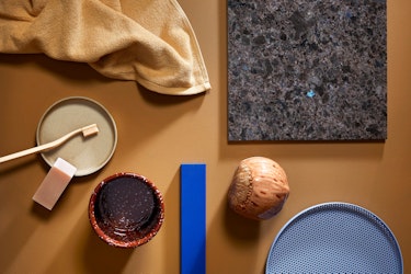
Lundhs Antique & Dijon Yellow
Dijon Yellow 10001 from Jotun is a spicy, deep shade of yellow. The warm colour sits beautifully against the warm undertones in the Lundhs Antique stone itself, making it almost glow. What’s particularly interesting is that the blueish crystals are highlighted, as blue and yellow complement each other well. The perfect accompanying contrast to the warm mustard yellow, the strong Yves Klein Blue shown in this mood board in the form of Blue from Pure & Original creates a striking complementary focal point. When it comes to textures and materials, putting together a palette of yellows and browns can be exciting, especially in the form of painted surfaces, but woodwork and leather are also ideal. Dijon Yellow 10001 works well in a range of different rooms, from the kitchen and hall to the bathroom.